My Game Said Rotate Your Phone. I Still Had to Decide What Rotation Did.
My browser game needed a landscape screen. A message recommending landscape didn’t settle what happened when the player rotated the phone anyway.
The game still needed rules for the canvas, the touch controls, the held input, and the running battle. I couldn’t solve that by changing the wording of the message.
On October 30, 2026, I revised the mobile wrapper around my Unity WebGL game, PERSISTENCE. The recorded change covered four web-template files. It didn’t rebuild the Unity binary.
The mistake cost me a dependable mobile layout and rotation behavior. I don’t have a timed playtest showing how many minutes players lost. What I have is the before-and-after implementation record and browser checks, with actual-phone verification still open.
I started with the usable rectangle
A 16:9 game scene doesn’t naturally match every landscape phone or tablet. A long phone can need empty space at the sides. A tablet can need it above and below.
I chose to preserve the scene rather than stretch it to every screen shape. The wrapper fitted the game into the available area and kept touch controls inside the same rectangle.
The available area included the browser’s visible region and the safe-area insets. I also checked that the implementation didn’t subtract the same inset twice.
That last check mattered. It’s possible to keep everything technically inside the screen by making the game unnecessarily small. “Nothing overflows” doesn’t prove the space calculation is right.
Rotation became a state change
Portrait mode now covered the game with a rotation prompt and paused the battle. It released input too. Returning to landscape didn’t instantly resume play; the player had to continue explicitly.
I wanted that pause to be predictable. A held movement input shouldn’t survive a screen transition unnoticed. Coming back to the correct orientation shouldn’t put the player into motion before they’ve found the controls again.
Those are design choices for this game. I haven’t measured whether every player prefers them, and I wouldn’t apply them blindly to a reading app or a turn-based interface.
The browser checks had specific boundaries
The implementation was AI-assisted. My verification used Chromium mobile emulation against the public build, plus separate checks for API outcomes and viewport changes.
| Recorded condition | What was checked |
|---|---|
| 844 × 390 landscape | Canvas fit and edge visibility |
| Simulated 47px notch / 21px bottom inset | Controls and scene inside the safe region |
| 667 × 300 landscape | Fit in a short visible area |
| 1024 × 768 tablet | Aspect ratio preserved with empty space |
| 390 × 844 portrait, then landscape | Blocking prompt, pause, input release, manual resume |
The record also checked canvas display and render-buffer aspect ratios, three-column growth selection, and movement touch input. It reported no browser errors in that run.
The inset values were simulated. They weren’t measurements taken from an iPhone. Keeping that sentence beside the table prevents an emulation result from turning into a device-support claim.
Orientation lock was an enhancement, not my only guard
The wrapper requested landscape lock after entering fullscreen where supported. It also attempted the supported path in the home-screen web app.
But an API can be absent or refuse the request. MDN marks ScreenOrientation.lock() as having limited availability and describes restrictions around its use. I couldn’t assume that requesting a lock meant the phone would stay landscape.
The rotation prompt therefore remained necessary. I tested lock success and rejection with API substitution, and checked the message for unsupported fullscreen.
Those substitutions exercised my branches. They didn’t establish real Safari or Android behavior. I hadn’t completed that device verification when the October record was written.
Don’t make the browser chrome disappear in the test report
A webpage can’t promise to remove a mobile browser’s address bar at will. I kept fullscreen and home-screen guidance, with a fallback when fullscreen wasn’t available.
I also wouldn’t accept a screenshot alone as proof of rotation handling. A screenshot can show a well-fitted canvas while saying nothing about whether the battle paused or an input stayed held.
For the same reason, I wouldn’t count a correct portrait warning as a complete fix. Returning to landscape is part of the path. The input release and explicit resume check belong to that return trip.
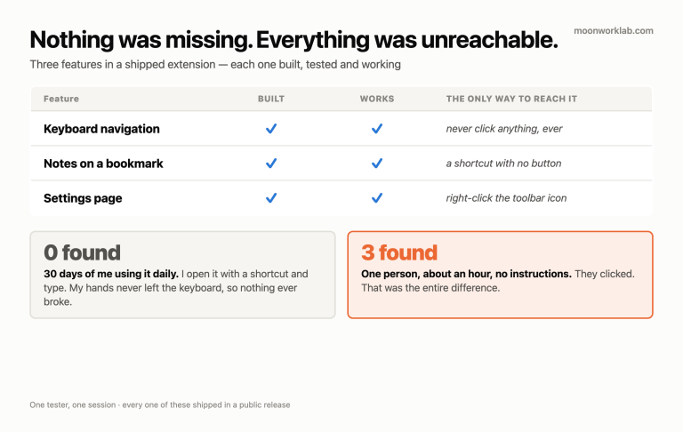
I’d previously passed broken menus with a click test. This time I needed both visible geometry and state transitions in the evidence.
What this release did, and didn’t, prove
The wrapper changes were deployed. The recorded browser checks passed. The game scene and controls used the fitted rectangle, and the rotation flow paused and resumed as designed in that environment.
I still hadn’t verified actual iPhone Safari behavior, Android orientation locking, browser-bar motion on physical devices, or sustained mobile performance. I won’t fill those gaps with the word “responsive.”
The useful outcome was a concrete contract: fit the scene, keep controls with it, stop safely in portrait, and wait for the player before resuming. A recommendation to rotate the phone had never specified any of that.